Interactive Tools to Study Contouring Variation
Interactive “Population Results”
Studying variation is a critical step to improving quality. Lots of users have been asking “when are we going to be able to see population statistics in the Contouring Accuracy Program (CAP) like we can with the Plan Study Program?” Well, the wait is finally over, and we’re excited to announce our newest feature in the Contouring Accuracy Program: Population Results!
The new Population Results tab is available once you’ve submitted your initial solution. This module provides a unique look at the variation present in the anatomical contouring process, using two distinct sections:
- Performance Histograms. Just like you can see histograms of plan scores (and metric results) in the plan study program, now you can see a histogram of contouring scores and Dice Coefficients. The scores can be filtered to initial contouring attempts vs. latest attempts, over all members.
- Consensus Contours. We also display a navigable, 3D display of “contouring frequency” which is displayed as a “heat-map.” This allows you to compare your contours (and the expert contours) to the overall population. Again, you can filter to initial vs. latest contour data. This provides a unique opportunity to study common errors in contouring and identify areas where targeted training can have maximum effect.
The CAP populations will be dynamic and ever-updating as new contour data are entered by the population. The Population Results tab will be enabled shortly after each structure is released (once a sufficient population size has been reached), and then you can tune in not just once, but keep revisiting over time, to see how the population statistics and consensus data evolve over time.
See Figure 1 (below) for a quick demo of where you can find the Population Results. Figures 2-4 illustrate some of the early results.
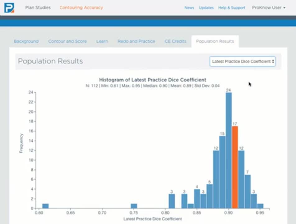
Figure 1. This short animation shows how to get to the “Population Results” tab and use it to view both histograms of scores and also consensus contours over the population of users.


